RELEASE 2.4.0 OR ABOVE
Default setting (common)
| Key | Type | Description |
|---|---|---|
| name | String | Set the name of the button. The name of the button must be unique and must be set as required. {
name: 'buttonName'
}
|
| label | String | The label of the button. Shown as a tool tip. {
label: 'button label'
}
|
| type | String | RELEASE 2.7.0 OR ABOVE The type of button. {
type: 'button'
}
// 또는
{
type: 'dropdown'
}
|
| iconSVG | String | The SVG tag or IMG tag for the icon to be shown on the button. {
iconSVG: '<svg xmlns="http://www.w3.org/2000/svg" version="1.1" viewBox="0 0 16 16">....</svg>'
}
// 또는
{
iconSVG: '<img src="data:image/png;base64,......">'
}
|
| iconName | String | The name of the icon to be displayed on the button. {
iconName: 'bold'
}
|
Define the button
| Key | Type | Description |
|---|---|---|
| onClickFunc | Function | The action to perform when you click the button. {
onClickFunc: function (event) {
// Action to be performed
}
}
|
Define the dropdown button
RELEASE 2.7.0 OR ABOVE
| Key | Type | Description | ||||
|---|---|---|---|---|---|---|
| onClickFunc | Function | The action to perform when you click the drop-down; if the drop-down is a split button (isSingle: verse) it will operate when you click the first button. {
onClickFunc: function (event) {
// Action to be performed
}
}
| ||||
| isSingle | Boolean | Set whether to use the dropdown as a single button or a split button. (Default: true) {
isSingle: true
}
| ||||
| useIcon | Boolean | Whether to use the dropdown as an icon button or a text button. (Default: false) {
useIcon: false
}
| ||||
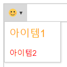
| dropdownItems | Object[] | Sets the list of items in the drop-down. {
dropdownItems: [
{ label: 'Item1' },
{ label: 'Item2' },
{ label: 'Item3' }
]
}
|
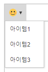
Drop-down items (dropdownItems)
| Key | Type | Description |
|---|---|---|
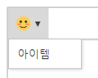
| label | String | The drop-down item label. {
dropdownItems: [
{
label: 'Item'
}
]
}
|
| onClickFunc | Function | The action to perform when you click a drop-down item. {
dropdownItems: [
{
label: 'Item',
onClickFunc: function () {
// Action to be performed
}
}
]
}
|
| cssText | String | The CSS text to render the dropdown item. {
dropdownItems: [
{
label: 'Item1',
cssText: 'font-size: 20px; color: orange;'
},
{
label: 'Item2',
cssText: 'font-size: 15px; color: red;'
}
]
}
|